Styling a house that already looks good: The Reveal!
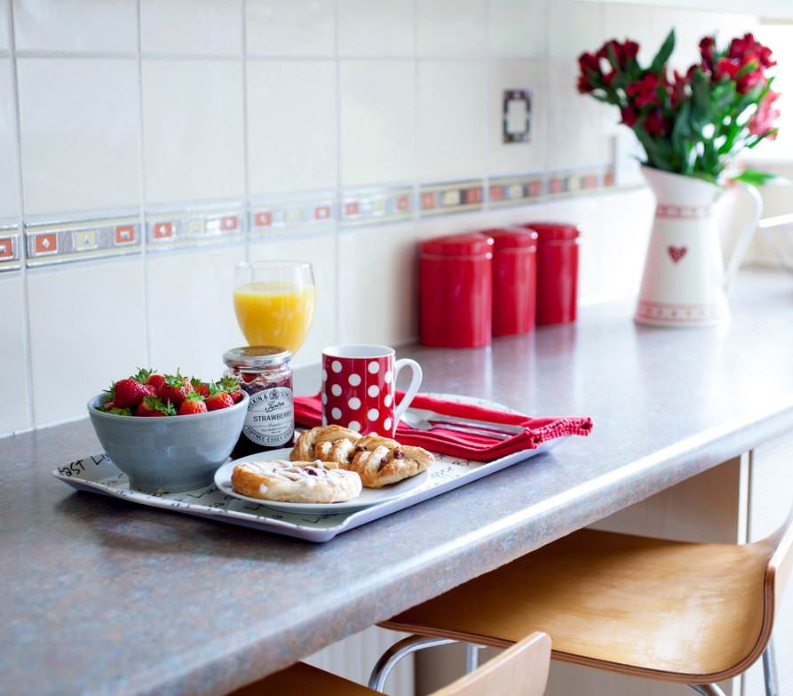
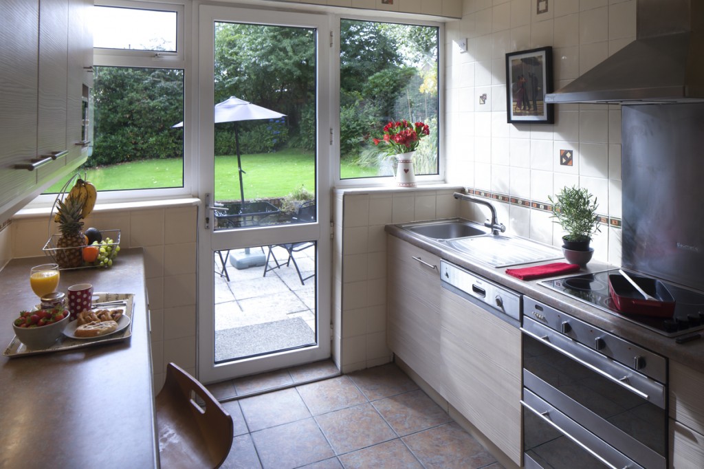
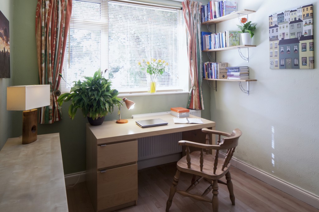
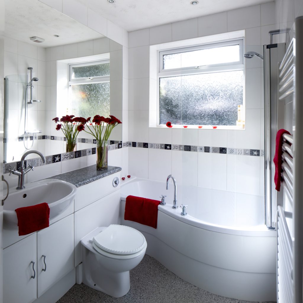
Today’s guest post comes from Anna Hart – a fabulous homestager and good friend. She has been working on a client’s home for me to prepare it for photography, and over three Saturdays she’ll be sharing her secrets with you! This is the last of my 3-part blog detailing a styling shoot for one of Sam’s clients. Read Part 1 Preparation and Part 2 Style-it-up for the whole story. It took a few days for fabulous photographer Andy Marshall to send the images over to us, and boy was I excited when I saw them – especially looking back to see the original estate agency listing photos, well the difference is huge! In the previous photos the house looked a little dull and uninspiring. But in the new images a large, bright, versatile home comes to life! My particular favourites are the bathroom which looks absolutely amazing with its injection of red, and the third bedroom because of the transformation we made from ‘work-a-day office’ to ‘sophisticated study that could be anything else you wanted’. And I just love the breakfast tray shot!
If you’d like my help to sell your home more effectively, please answer a few short questions here and if I think I can help you, I’ll be in touch.


