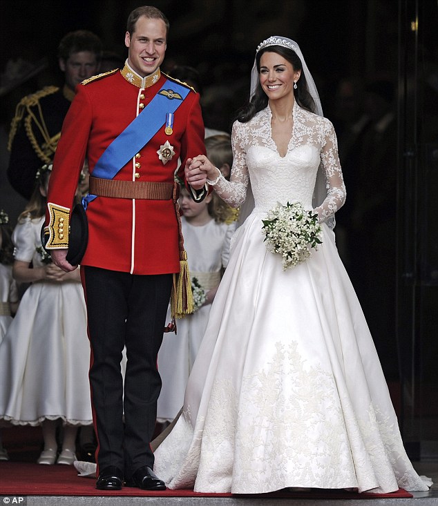
Remember Kate and Will’s Royal Wedding? If you’re anything like me, you were eagerly awaiting that first magical glimpse of Kate’s dress. For months, it was the subject of conjecture and rumours, and still managed to end up a complete surprise. No one knew who the designer was, the colour or the style. And don’t we just love it? The surprise for me, and millions around the world, added to the excitement and enchantment of that wonderful day.
Kate’s determination to keep the secret is something that every seller could learn from! When we sell our home, there is a tendency for the estate agent to try to show everything, warts and all, in the brochure and photography. The property of a client of ours, has been listed on Rightmove with 52 photographs! The problem with this, is that a buyer will make a decision about whether or not to view a home based on the photographs, and if there are images of every nook and cranny, they don’t need to come to see it! In this sense, less is definitely more. Or in marketing speak, you need to sell the sizzle, and not the sausage. Here are my top 5 tips for keeping your viewers interested and excited about your house:
1. Make sure there are no more than 6-10 photographs in your online advert. Any more than this, and you risk losing their interest before they have even seen the best features of your home;
2. Look at your description, both in your online advert and also in your brochure. Is the copy wordy and overly descriptive, complete with full measurements and every power point listed? It should be punchy, full of emotive language and enthusiasm. Create atmosphere with the wording, and make sure every word entices a buyer to view.
3. Your brochure should include up to 20 photographs, but at least half of these are better as ‘lifestyle’ shots. These could be a glimpse of the garden through the gate, a window seat with an open book and a cup and saucer, or a posy of flowers on a bedside table. If you have a country property, try a shot of muddy wellies by the back door, or a stack of logs in the sunshine. Urbanites could try a bowl of limes on a shiny kitchen surface, or a bottle of bubbly and two glasses on the coffee table, with just low lamps lit.
4. When your viewer arrives, make sure all your internal doors are closed. Invite them to go first into each room, opening the doors like opening a present. In this way, they ‘take ownership’ of the house.
5. Try to make some little secret corners, in your house and also in the garden. This might be a little reading corner, or a garden bench hidden by shrubs, and secret paths are loved by adults and children alike.
You only get one shot to make a great impression on a viewer. If they are under 40, they are most likely very used to browsing online, and with a click, you’ve lost them. Unless you can pique their interest and hold their attention long enough to create a desire to know more. Do it right, and they’ll reach for the phone, and book that viewing.
As for Kate’s dress, well it was certainly worth the wait.
If you’d like my help to sell your home more effectively, please answer a few short questions here and if I think I can help you, I’ll be in touch.


So true, less is always more! I have known people not to view a house, put off by a slightly bright wall colour in 1 room! Madness but you want to show them the best of the best not everything where the tiniest detail could put someone off viewing! Also LOVE the idea of the lifestyle shots simply fab idea to sell the romance of your home and the way you live and use the space every seller should take heed.
I just love lifestyle shots… they can be romantic, atmospheric, aspirational, nostalgic, and just simply gorgeous! Thanks for your comment Kathy.